Using Viewports for Responsive Design
Using Viewports for Responsive Design
As you create a new web project, considering how content displays on multiple devices is vital. Until now, it’s been a time-consuming task because there are so many options. On mobile devices, there are different screen sizes. On desktops, there are different monitor sizes.
To help you efficiently create documents that look great on a wide range of devices, we created the Layout Viewports tool. You can see how your work displays on different monitors and screen sizes during the design process.

With the Readz Design Studio, you have 2 main viewport group: desktop and mobile. All viewports within the desktop group will show you the exact same content, layout, and styling, just for different screen display sizes. Any change you make on a desktop viewport will be visible and applied to all viewports within the desktop family.
In the same way, all viewports within the mobile group will show you the exact same content, layout, and styling, just on different screen sizes, and any change on a layout in the mobile viewport is applied across all mobile viewports.
So in essence, you have 2 variants, desktop, and mobile, and we offer you different display sizes to look at these two variants.
Here is a list of the different viewports you can use to check how your design looks across different devices. And of course, you can immediately edit the content in any of those viewports.
Desktop display sizes:
All the viewports below show the desktop variant. It is the same content and layout but shown in different resolutions.
1366 x 768 px
1600 x 900 px
1920 x 1080 px
2560 x 1440 px
"Fit to window" is not a physical display size, but with this view, the canvas will fit itself into the current size of your browser.
Mobile display sizes:
All the viewports below show the mobile variant. It is the same content and layout but shown in different resolutions.
The mobile display sizes are organized by screen width. Within each screen width, we offer you the possibility to select different heights when available.
Screens with 360 px width
Samsung: Galaxy S5, Galaxy S6, Galaxy S7, Galaxy S7 Edge, Galaxy S8, Galaxy S8+, Galaxy S9
Screens with 375 px width
Apple iPhone: 6, 7, 8 and Xs, 11 Pro
Screens with 414 width
Apple iPhone: 6 Plus, 7 Plus, 8 Plus, Xr, Xs Max, 11, 11 Pro Max
Screens with 768 width
Apple iPad
On the Readz canvas, you can select the different phone sizes.
1. Locating the viewports tool
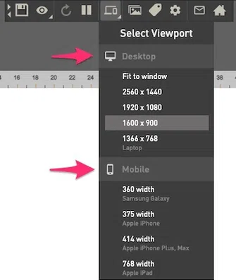
Access the Layout Viewports tool inside the Design Studio. The Select Viewport button is on the menu bar at the top of the page.
2. Selecting a display device
- Click the Select Viewport button on the top menu bar. The main panel displays mobile and desktop view options.
- Click an option. The content on canvas adjusts to simulate the display on that device size.
Note: the desktop and mobile icons are not clickable, you need to select an option.
3. Selecting a mobile viewport
4. Using the viewport slider
Depending on the size of your browser window or how you've configured your browser's zoom setting, you might see the viewport panel on the canvas. The viewport panel works like a scroll bar. It lets you scroll the canvas to see all of the content.
- If you’ve selected a mobile device, scroll up and down.
- If you’ve selected a desktop monitor, scroll in all directions.
To view the content you're editing completely (and to remove the viewport panel) either enlarge your browser's window or reduce the Zoom setting of your browser.
White space on the viewport panel indicates content currently not visible on your monitor.
- Click the black bar on the viewport panel.
- Drag the black bar up and down for mobile devices and in all directions for desktop monitors. The content on the canvas moves with the black bar.
- To reposition the viewport panel on the canvas, click and drag the panel to a new location. The mouse pointer changes to 4 arrows when it hovers the viewport panel.
Contact Support
STAY IN THE LOOP
Sign up for product updates
