Manual / Minimum Height &
Hug Content
Manual / Minimum Height &
Hug Content
Hug Content
In this article, we will talk about the concepts of Manual (or Minimum) Height (mH)and 'Hug Content', how these impact height settings, why it matters to you and most importantly, what you need to do to create good-looking and correct responsive layouts.
What is Manual (or Minimum) Height and Hug Content?
Readz is a visual design platform. It allows you to move and resize content elements simply by moving, dragging and stretching them within the canvas.
Whenever you stretch a box out on the bottom, you are in fact manually adjusting its height. The platform will register the height you just set. When you are creating layouts, stretching boxes is a natural step of the process.
This 'manual' height is different from 'auto-set' height by the platform. 'Auto' height happens when for example, a box will expand its height because you place a larger content element in it, to allow the new content to fit.
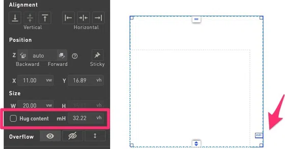
The mH is visible in the layout panel on the left, and in the canvas through an indicator on the element.
'Hug Content' indicates that the selected element will always adjust its height to fit neatly around the content in the element. It is the setting you would use most.
By default, elements with content will be set to Hug Content, or in the case of text elements, switch to it as soon as content is entered.

An element's minimum height (mH) can be edited in the layout panel or by sliding the blue indicator on the right side of the element.
Differences between manual height and 'auto' height
A content element that has a manual height setting - as set by you, the user - will keep that height as a minimum. So that element will not take a smaller height than what you have defined (to respect your setting) but will stretch beyond that manual height if the need arises:
An example of stretching beyond the manual height would be if for example you create a text box, set a manual height, and now you are pasting more text into it. The box will stretch (if needed) to accommodate the new text since that is what you want at that point.
When an element is set to 'Hug Content', the height of the element will always reduce or increase its height to fit the content in it.
Why does it matter?
When creating layouts, you will be using different units for different things: vw / vh (viewport width and viewport height), pixels and rem (for fonts).
Potential layout issue : undesired empty space
Using responsive units is a best practice, but these units can scale differently in some circumstances. This will not represent a problem in most cases, but there is one specific case where it will pop up: when a screen's width changes significantly and the height remains somewhat constant, text inside a box will scale down more than the box itself.
This will become visible in layouts where you have long chunks of body text and the result will be that you will have empty gaps in your layout with narrow screens on a desktop.
Correctly use mH and Hug Content
In most cases, the setting you would want for height is 'Hug Content'. This will assure that the box or parent neatly fits to the content in it. However, you might have stretched a box and forgotten about it. No problem, you can turn on the Hug Content setting at any time.
Also, if you would want to add negative space at the bottom of an element, the system will automatically switch to adding bottom padding instead of increasing the mH if you let it. And whenever you add padding, the system will turn Hug Content on.
You will see a message informing you of this behavior whenever you add padding to the bottom of an element.
Adding padding: the correct way to add negative space
Imagine you want to add some negative space at the bottom of a box. You might be tempted to just strecht the element out - but as explained above, this will actually manually set a minimum height which can cause empty gaps in your layout.
So instead, adding padding is the correct way to add negative space.
Whenever you stretch the bottom of a box, the system will remind you to add padding, and when Hug Content is switched on, automatically add padding for you. And whenever you add padding, the system will turn Hug Content on.
You will see a message informing you of this behavior whenever you add padding to the bottom of an element.
Contact Support
STAY IN THE LOOP
Sign up for product updates
